It started with a single gray eyebrow hair.
I was sitting in my car, stopped at a light, when I caught sight of it in the rearview mirror—glinting in the sun like it had something to say. I didn't laugh. I stared. Because in that tiny flash of silver, I saw something I couldn't ignore: I'm aging, and there's no hiding it. For a moment, I just sat there, reflecting on my attitudes toward aging—what I'd accepted, what I'd resisted, and what I still didn't understand.
Like so many women in midlife, I'd begun noticing subtle shifts: restless sleep, fluctuating energy, a body that felt a little different than it used to. I wouldn't say my concerns were dismissed, but I did find myself working harder to get answers. I wanted a partner in care, someone to help connect the dots, follow up, and explain what was actually happening beneath the surface. The truth was simple: the system wasn't built for this stage of life.
That's the gap Effica exists to close.
When our co-founders created Effica, their goal was simple yet bold: to reimagine midlife care that truly centers women. Not symptoms, not statistics, but women. They understood that clarity is the foundation of agency, and that agency—the ability to ask, act, and advocate—is what transforms how we experience our health.
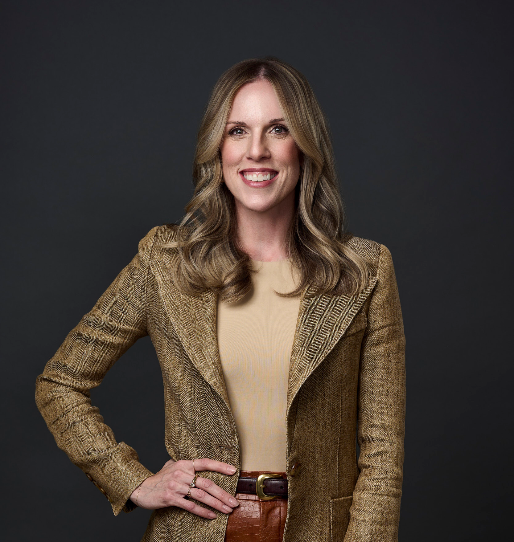
I joined Effica early on, helping to shape a brand that could hold both science and soul. My background is in journalism and communications, and after years of interviewing experts, writing a bestselling book for women in midlife (The Glow Code), and hearing countless women share the same story, I knew what was missing wasn't just care. It was connection.
So we built that into the brand.
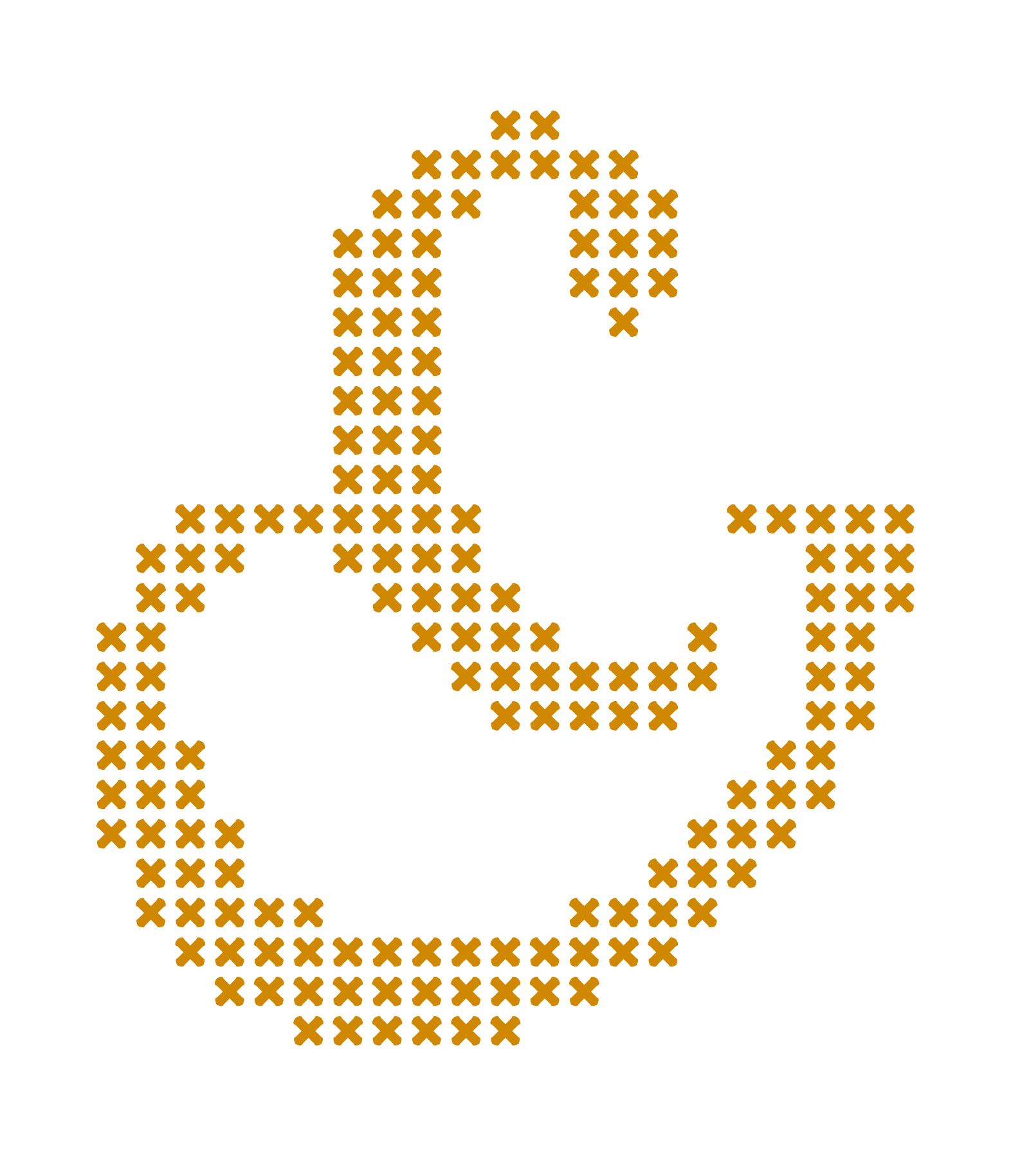
The name Effica comes from efficacy—the power to deliver real results—and that idea threads through everything we do. Our logo and stitched motif are reminders of connection, repair, and strength. Each stitch represents a thread of women's lived experience woven together with clinical expertise, compassionate care, and digital innovation.
The ampersand in our brandmark—a graceful "E" entwined with an "&"—symbolizes partnership. It says, "We walk alongside you." You and your provider. You and your body. You and your next chapter. There's always an and.
Even our wordmark tells a story. Its organic serifs were inspired by the roots and branches of a tree, grounded yet growing. Because midlife isn't an ending; it's an expansion.

Our colour palette—blue for clarity, cream for warmth, gold for light— reflects what we stand for: evidence-based care that feels deeply human.
"Every stitch represents a thread of women's lived experience woven together with clinical expertise, compassionate care, and innovation."
And "Midlife care, made for us" isn't just a tagline. It's a promise. Every woman's story is different, and every thread matters. Some arrive seeking relief from night sweats or brain fog. Others are looking for answers after years of feeling unheard. All deserve care that listens first, explains clearly, and acts with integrity.
But beyond the care itself, Effica is building something bigger—a community. We're weaving together women, clinicians, and experts to create spaces for learning, laughter, and a whole lot of "Finally, someone gets it." Whether it's through our platform, our digital tools, or right here in Threaded, our goal is to help women feel supported, equipped, and seen.
When I look at Effica's brand, I see more than a logo and a colour palette. I see proof that the way we tell women's stories—visually, verbally, and culturally—matters. Because when we see ourselves reflected with clarity and respect, something shifts. We stand taller. We ask better questions. We lead our own health journeys.
Effica's story is still being written, but the threads are strong. Every colour, every stitch, every curve of the logo is there to remind women: we see you, your experience matters, and you deserve agency over your health.
Here's to reclaiming it.